But, what about normal flow?
@ErinJZimmer
https://layouts.ez.codes


Normal flow
elements on a webpage lay out in normal flow if you haven't applied any CSS to change the way they behaveMDN
Not-normal flow
display: flex/inline-flex/grid/inline-grid/tableposition: absolute/fixed/stickyfloat: left/rightcolumn-count: some_number<table />
A heading element
some text in a paragraph
- What normal flow is for
- How normal flow works
- When not to use normal flow
normal flow is
for laying out
documents
elements that hold other elements Block elements
						<article> <details> <p> <fieldset> <header> <h1/2/3/4/5/6>
						<footer> <ul> <ol> <li> <nav> <section>
elements that are content Inline elements
<abbr> <cite> <code> <em> <strong> <img> <label> <time> <video>
the rules
- Block elements can contain anything
- Inline elements can only contain other inline elements or text nodes
Block elements
						<article> <details> <p> <fieldset> <header> <h1/2/3/4/5/6>
						<footer> <ul> <ol> <li> <nav> <section>
<div>
.block-element {
   display: block
}
sizing
CSS is Awesome
We can set the size relative to
- the viewport
- the container
- the content
by default, it's responsive
all content will be visible, and the container will fit the available space
width = 100%, height = min-content
change the width, the height changes, still responsive, great
change the height might be ok, might be bad
you prefer things to look pretty, but the browser prefers everything to be visible
so, overflow (the browser thinks you've made a mistake)
best practices
- prefer not to set width and esp height
- consider min/max-width/height (example of like a modal or something)
- also min/max-content (demo)
- scrollbars
🍽️ restaurants
🏩 hotels
🏺 museums
💸 ATMs
.tag-container {
	width: fit-content;
}
Good news everyone
I'm sending you on an extremely controversial mission!
.header {
	height: var(--header-height);
}
.content {
	height: calc(100% - var(--header-height) - var(--footer-height));
}
.footer {
	height: var(--footer-height)
}
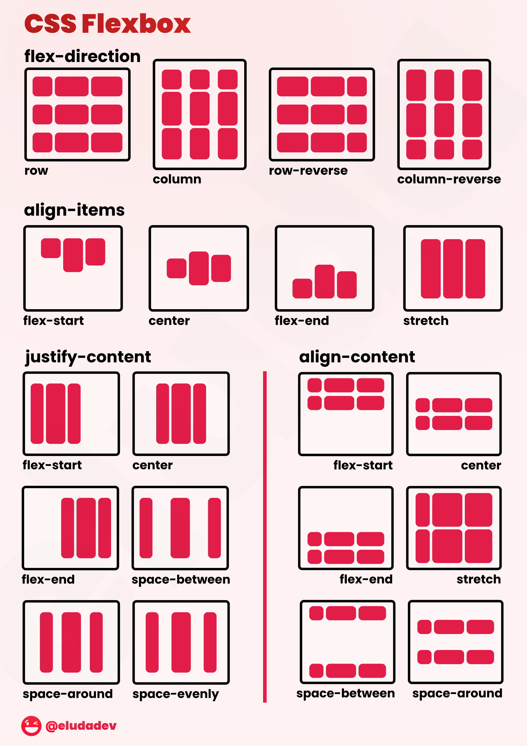
.container {
	display: flex;
	flex-direction: column;
}

.content {
	flex: 1;
}
positioning
positioning
- each element appears below the previous one, we can't change that
- move vertically, using margin-top
- move laterally using margin-left/margin-left with negative value/margin: auto
margin collapse
chapter 1
Far out in the uncharted backwaters of the unfashionable end of the western spiral arm of the Galaxy lies a small unregarded yellow sun.
_-_67.webp)
Orbiting this at a distance of roughly ninety-two million miles is an utterly insignificant little blue green planet whose ape-descended life forms are so amazingly primitive that they still think digital watches are a pretty neat idea
chapter 2

positioning
positioning
.container {
	display: flex;
	flex-direction: column;
	justify-content: center;
}
positioning
.container {
	display: flex;
	flex-direction: column;
	justify-content: end;
}
 Amy
Amy

Nibbler
 Nichelle Nichols
Dr Zoidberg
 Mom
Mom
 Professor Farnsworth
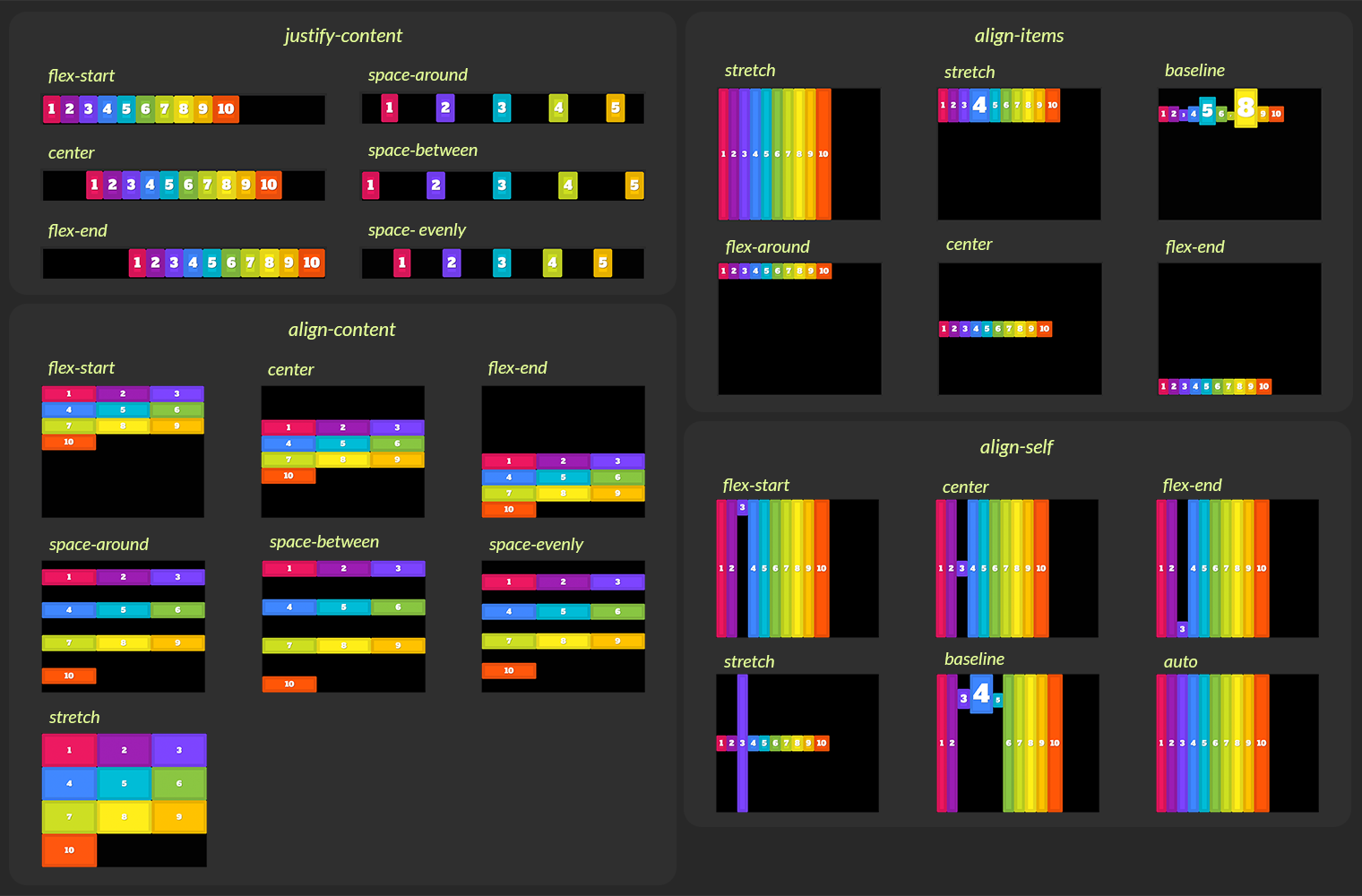
.container {
	display: flex;
	flex-wrap: wrap;
	align-content: start;
}
Nibbler
Nichelle Nichols
Dr Zoidberg
Mom
Professor Farnsworth
.container {
	display: grid;
	grid-template-columns: repeat(3, 1fr);
	align-content: start;
}
We care
Our crew is replaceable. Your package isn't.
Our business
We'll use our giant spaceship to deliver your package, no matter how uneconomical it is
.container {
	display: grid;
	grid-template-columns: repeat(2, 1fr);
}

.logo {
	grid-column: 2;
	grid-row: 2;
}

.our-business {
	grid-row: 3;
}
Block elements
- Sized absolutely, or relative to viewport, container, or content
- Positioned using margin
- Can't size relative to siblings
- Can't position vertically relative to end
- Can't position relative to siblings
inline elements
<abbr> <cite> <code> <em> <strong> <img> <label> <time> <video>
<span>
.inline-element {
   display: inline
}
sizing
An inline element is
the size of its
content + padding
the size of its
content + padding
sizing
an inline element
size is the size of the content + padding
we can't change it
Lineboxes
Far out in the uncharted backwaters
backwatersoftheunfashionable
unfashionableendofthe
westernspiralarmofthe
Galaxyliesasmallunregarded
yellowsun
Lineboxes
Far out in the uncharted
backwaters of the unfashionable end of the western spiral arm of the Galaxy lies a small unregarded yellow sun
Lineboxes
Far out in the uncharted
backwaters of the unfashionable end of the western spiral arm of the Galaxy lies a small unregarded yellow sun
Block elements create lineboxes
Inline elements are laid out in lineboxes
Positioning
Orbiting this at a distance of roughly ninety-two million miles is an utterly insignificant little blue green planet whose ape-descended life forms are so amazingly primitive that they still think digital watches are a pretty neat idea.
can see the line-boxes in firefox
element can break over line boxes
we can shift element laterally using margin
we can't shift vertically using padding or margin
line boxes can be different sizes
we can move text relative to the line box
middle = baseline + half x height
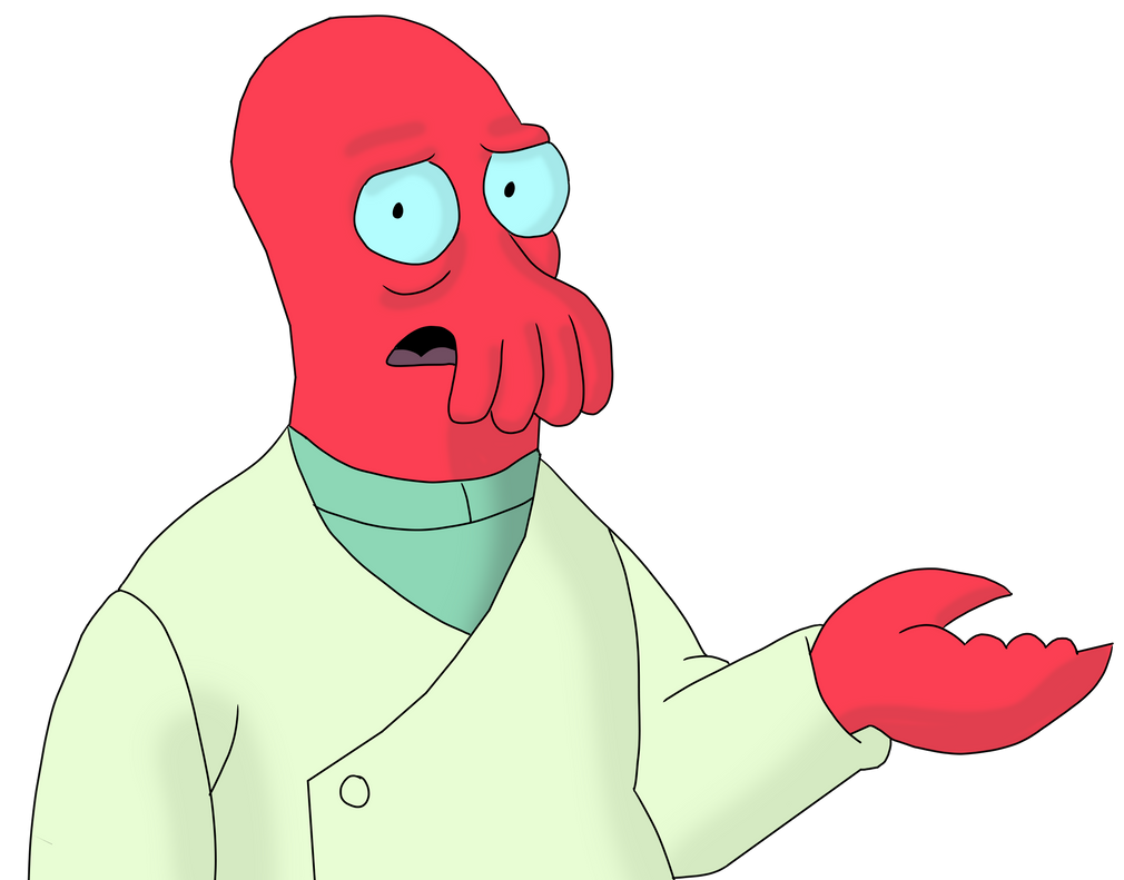
Delicious popplers! 
MDNvertical-align: middle
Aligns the middle of the element with the baseline plus half the x-height of the parent.
Delicious popplers!
vertical-align: middle
Aligns the middle of the element with the baseline plus half the x-height of the parent.
Delicious popplers!
vertical-align: middle
Aligns the middle of the element with the baseline plus half the x-height of the parent.
Delicious popplers!
vertical-align: middle
Aligns the middle of the element with the baseline plus half the x-height of the parent.
Inline elements
- Are the same size as their content
- Position horizontally with margin/text-align
- Position vertically with vertical-align
- Vertical align is relative to the linebox
Some text with a in it
Inline-block elements
- Live in parent's linebox
- Create lineboxes for their children
- Can set size manually
what did we learn?
- Normal flow is everywhere
- Normal flow is trying to lay out a document
- Block, inline, inline-block,
linebox - Sometimes normal flow
just isn't the answer
@ErinJZimmer
Thank you!